My favourite GPS manufacturer Garmin announced their new logo a week ago. This is the old one they've used for the past 16 years. Nice globe.
 This is the new one; it's very classy.
 Naturally, one might ask what the triangle represents. The reply from the person writing in the company blog was: we don't really know; you tell us!
And I thought, wow! The customer needs to activate their prior knowledge and schema to interpret the logo! Which is most brilliant because the logo then becomes an apt metaphor for what Garmin is all about. It is understood best by the individual using the device, for everyone has different ideas, objectives, and how to use it. It's pretty much open-ended...
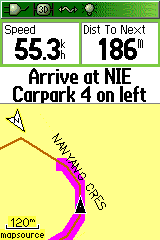
Generally though, on any Garmin GPS, the pointer/cursor/triangle represents where you are. It also points to the heading that you're travelling on.
So it can just be that; a simple pointer. Or it could be a mountain. I think it represents something that urges the person on. The pointer will be on the GPS screen even when you need to move around obstacles (like, for e.g., the embarrassingly lame SS assignment I handed in recently), and eventually, it'll lead you to the destination. You just have to keep on moving forward until the next waypoint appears. The satellites will take you there...
Naturally, one might ask what the triangle represents. The reply from the person writing in the company blog was: we don't really know; you tell us!
And I thought, wow! The customer needs to activate their prior knowledge and schema to interpret the logo! Which is most brilliant because the logo then becomes an apt metaphor for what Garmin is all about. It is understood best by the individual using the device, for everyone has different ideas, objectives, and how to use it. It's pretty much open-ended...
Generally though, on any Garmin GPS, the pointer/cursor/triangle represents where you are. It also points to the heading that you're travelling on.
So it can just be that; a simple pointer. Or it could be a mountain. I think it represents something that urges the person on. The pointer will be on the GPS screen even when you need to move around obstacles (like, for e.g., the embarrassingly lame SS assignment I handed in recently), and eventually, it'll lead you to the destination. You just have to keep on moving forward until the next waypoint appears. The satellites will take you there...
 This is the new one; it's very classy.
 Naturally, one might ask what the triangle represents. The reply from the person writing in the company blog was: we don't really know; you tell us!
And I thought, wow! The customer needs to activate their prior knowledge and schema to interpret the logo! Which is most brilliant because the logo then becomes an apt metaphor for what Garmin is all about. It is understood best by the individual using the device, for everyone has different ideas, objectives, and how to use it. It's pretty much open-ended...
Generally though, on any Garmin GPS, the pointer/cursor/triangle represents where you are. It also points to the heading that you're travelling on.
So it can just be that; a simple pointer. Or it could be a mountain. I think it represents something that urges the person on. The pointer will be on the GPS screen even when you need to move around obstacles (like, for e.g., the embarrassingly lame SS assignment I handed in recently), and eventually, it'll lead you to the destination. You just have to keep on moving forward until the next waypoint appears. The satellites will take you there...
Naturally, one might ask what the triangle represents. The reply from the person writing in the company blog was: we don't really know; you tell us!
And I thought, wow! The customer needs to activate their prior knowledge and schema to interpret the logo! Which is most brilliant because the logo then becomes an apt metaphor for what Garmin is all about. It is understood best by the individual using the device, for everyone has different ideas, objectives, and how to use it. It's pretty much open-ended...
Generally though, on any Garmin GPS, the pointer/cursor/triangle represents where you are. It also points to the heading that you're travelling on.
So it can just be that; a simple pointer. Or it could be a mountain. I think it represents something that urges the person on. The pointer will be on the GPS screen even when you need to move around obstacles (like, for e.g., the embarrassingly lame SS assignment I handed in recently), and eventually, it'll lead you to the destination. You just have to keep on moving forward until the next waypoint appears. The satellites will take you there...

Comments
Then again, I am just blabbering. =P